Assignment 6A- Poster Design Critique (Gestalt's Principles)
Wednesday, November 28, 2007
This assignment was to test us on Gestalt's Principles that were covered in the lecture. We have to scout for designs that we define as a good or bad design based on Gestalt's Principles.
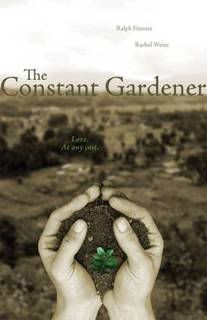
I worked with Fuzzy to look for and criticize 2 posters. The first poster that we classified as a good poster was The Constant Garderner's poster. The poster conveys a simple message and made use of several Gestalt's Principles such as continuity and flow.
I learnt more of analytical skills during this tutorial as I was exposed to not only my group's findings but also the posters that others found. It was very interesting to see that while some people might think that the poster is very cluttered, does not follow principles and classified as a bad design, it might actually be considered good to some who could see its underlying meaning.
Posted bymadguitarist at 8:42 PM 0 comments
Labels: critique
Assigment 2 - Abstraction : Critique and changes
Wednesday, November 21, 2007
The main issue was that the final abstraction I produced during the first draft was not as obvious that it is a dog. The 2nd last abstraction was deemed to be a better one. A coursemate suggested leaving the nose on the final abstraction as the nose is quite a significant part of the dog when we want to recognise something as a canine animal.
For the developed design, I traced it out on Photoshop using my Tablet pen and coloured it black for the first abstraction. Then I start removing details from the dog. Using the computer to do this is much easier as the dog remains at the same size except for the changes that I made.
This abstraction seem much better than the first and the final icon do look like a dog, which was quite an accomplishment.
Posted bymadguitarist at 11:08 PM 0 comments
Assignment 7: Children's Storybook : Storyline Creation and Design Processes
Today we got together to finalise the colouring details which Elizabeth and Furzanne have been busy with for the past few days. I was busy too, drafting out a rhyming storyline, which we have agreed on, as rhyming helps the children readers absorb and remember the story better.
Using Illustrator, Elizabeth and Furzanne
Posted bymadguitarist at 10:23 PM 0 comments
Assignment 7- Children's Storybook
Being the most important part of the entire portfolio, this was one project that I placed a lot of emphasis on. My group, Elizabeth, Furzanne and I got together to decide on the main storyline together the very lecture at which this was announced.
We decided on the theme of " Being loved even when you are different". This was partially inspired by the original theme which Julian gave us : God Created fly and forgot why
The main theme was forgotten; the character was created differently by God and was afterwards forgotten by its peers and left being ignored and unloved. This is a common situation even among young children, those who look different from most of them will be ostracized.
Thus, this is one important point we want to bring across to young children, whether they are the ones being bullied or are ostracizing others. We want to teach them that it does not matter if they are different, they might be given a special difference to be a hero to the others.
After showing our individual stories to the class, we decided on Elizabeth's story of a rabbit borned with wings. However, we were told to make some changes to the story. One point brought up was the theme of Death that Elizabeth added in to her story, was deemed to be not suitable for children . Elizabeth's rationale was that no mother will abandone the child even if the child is different. So, we have to think of a way to not let the mother be in the story, but yet still make the little rabbit sad enough to leave home, which was part of her storyline. In conclusion, we have decided to use her story but change it according to suggestions.
Posted bymadguitarist at 10:10 PM 0 comments
Assighment 6B - Website Critique
We were given a random list of universities to choose from and we were instructed to go a critique based on the website. Besides commenting on the design and how it does not follow Gestalt's principles and other principles at that, we have to think of ways to improve it in order to make it look better.
This is a build up of what I have learned int the previous tutorial on criticising posters. Besides knowing how to indentify the problem with the design, we must be able to think of ways to amend it. That is probably what visual communications is about.
I used functions on Powerpoint to highlight the problems and suggested ways such as rearranging the website using Photoshop in order to make it look better.
I have attached the slides to let everyone see what I did for the presentation.
Posted bymadguitarist at 9:02 PM 0 comments
Labels: website critique
Assignment 5 - HP Notebook Design: Critique and Developement
Wednesday, October 24, 2007
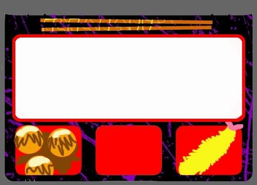
When I presented my idea of the Japanese Bento notebook design, some found it adorable and others found it amusing. But I am glad that most people liked the idea and did not have much comments about it. One of them did mention that the food could look more realistic.
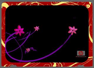
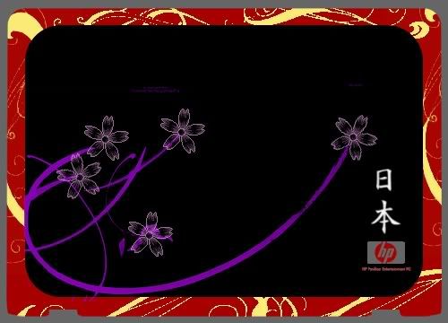
So, I went back and did my own critique of the design. The overall look was fine, but the flowers on the cover did not seem as obvious as it should be. The Sakura ( Japanese Cherry Blossoms ) are suppose to represent the country and its traditions on a bento box. So I used Photoshop and redesigned the flowers. I added an internal shadow to give it a fuller look and also brighten the colours of the purple stems slightly.
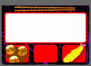
For the insides of the Bento, I gave the food items a slightly 3-dimensional feeling by using internal shadow and slight embossing. Now the food looks more realistic and less like something that I have drawn using my Tablet pen.
Here's the final product after the changes :
Posted bymadguitarist at 8:19 PM 0 comments
Labels: notebook-design
Assignment 5- HP Notebook Design
Saturday, October 20, 2007
This Notebook Design assignment is so far the one where I had the most freedom deciding what to do. We were given a choice as to what kind of theme we wanted to follow. During the lecture, we were to tell Julian what we wanted to based our designs on. I chose 'Japanese' and ' Music'.
The designing of the item is definitely more interesting then the others ,but I still have to consider that this is a Notebook design, so the specifications of the notebook have to be considered carefully when creating the design. I took very long staring at my own Notebook before I had an epiphany of an idea.
The basic structure of the notebook is very similar to that of a Japanese Bento. The Bento is a lacquered traditional Japanese lunch box. I was in fact very inspired by the interior of the laptop, because the huge keypad reminds me of the 'rice' section of the bento and the touch pad reminds me a lot of a dish compartment in the bento.
As for my 'music' themed design, I based it on a keyboard DJ machine, with a volume dial on the side and pitch tuning knobs. I took the touch pad into consideration and changed it into the black keys of a keyboard.
After looking at the two drafts of the design, I decided to develope the Japanese bento one as it is very much more unique and I am quite sure that most people would not have thought of it the way I did.
I chose to colour the given template in Photoshop, creating swirls for Sakura flowers stalks and had Japan's name written in traditional Japanese Kanji script at the right lower corner above the Hewlett-Packard logo.
The final design looked like this:
Posted bymadguitarist at 4:17 AM 0 comments
Labels: notebook-design