Assignment 5 - HP Notebook Design: Critique and Developement
Wednesday, October 24, 2007
When I presented my idea of the Japanese Bento notebook design, some found it adorable and others found it amusing. But I am glad that most people liked the idea and did not have much comments about it. One of them did mention that the food could look more realistic.
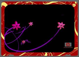
So, I went back and did my own critique of the design. The overall look was fine, but the flowers on the cover did not seem as obvious as it should be. The Sakura ( Japanese Cherry Blossoms ) are suppose to represent the country and its traditions on a bento box. So I used Photoshop and redesigned the flowers. I added an internal shadow to give it a fuller look and also brighten the colours of the purple stems slightly.
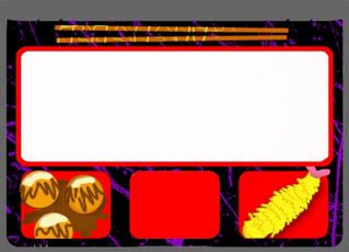
For the insides of the Bento, I gave the food items a slightly 3-dimensional feeling by using internal shadow and slight embossing. Now the food looks more realistic and less like something that I have drawn using my Tablet pen.
Here's the final product after the changes :
Posted bymadguitarist at 8:19 PM
Labels: notebook-design