Assignment 1 - Me, Myself and I: Update
Wednesday, September 12, 2007
The purpose of this assignment is to derive at 2 designs eventually, one of which represent something we like and the other, something we hate.
The previous post has the original sketches and after presenting to the class, I have gathered several comments. Firstly for the "I love Sushi" sketches, most of the class thinks that the one with the 5 pieces of sushi on the plate represents my name better then the one with the egg sushi.
However, there are still many changes that would make the name more obvious. One of this is the rearranging of the sushi rolls. Another would be to add gradient and touch up the remaining background of the picture.
Thus, I used Photoshop to re-do most of the picture. One of the main changes was to reshape the 'sushi rolls' into perfect round circles. The remaining touching up was to add shadow and gradient so that the entire image have a more 'real' feeling. Although this was not suggested by my course mates, but I think that it is essential to give the artwork my best possible touch up. Thus the final artwork of the 'I love sushi' A5 poster is ...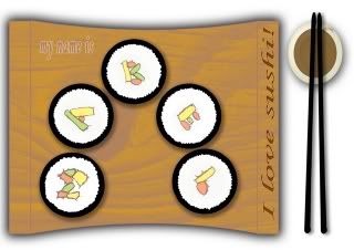
The 2nd artwork was based on what I hate, which I have mentioned in the previous post to be insects. One of the main things that was pointed out by my course mates was that the ants do not look as obvious as it should. The ants should be the focus of the design as it is the part of the design that conveys the main message. Thus I removed all the ants that I have drawn on the artwork after I scanned it into the computer and I recreated the ants on Photoshop. I added the 'emboss' effect to make the ants seem like they are 'smashed' into the shoe print. And to add to the realistic feeling of the artwork, I added a fallen leaf and a wilthered flower to add to the natural setting. A muddy texture is also added to the area outside the shoe print to make it look like real soil. The an internal shadow is added to the shoe print to have the 'impressed' effect and to make it look sunken and not as flat as the drawn sketch.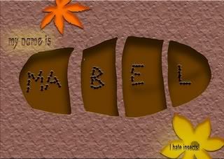
After all the changes, the final artwork for the "I hate insects" artwork is as such...
Posted bymadguitarist at 10:11 AM 0 comments
Labels: me myself and I
Assignment 1 - Me Myself and I : Design Process
Saturday, September 8, 2007
This blog is started for NM2208.
I guess this will be pretty interesting for both myself and the tutor to keep track of my ideas and what I plan to do.
Firstly, I think I might want to keep track of my initial design for the first assignment. These are hand-drawn and presented to the class during the first tutorial. The topic was something like: My name is _____ and I love/hate _____.
So, the first thing that I thought of that I love was music. But after thinking it through, it is very hard to materialise my passion for music in to something on paper. Besides, the idea itself might be overused by my peers. So I decided on something more specific: sushi. It's not only my favourite food, it represent my love for Japan and all of Japan's wonderful culture. Thus, my sketches below show an egg sushi with the brown patterns showing my name and the second picture show 5 sushi rolls with the ingredients inside showing alphabets of my name.

Then for the thing that I hate, despite the ordinariness, I decided to focus on my dislike for insects. So I thought of the ways that I can kill insects with. So I came up with 2 basic drawings for the theme of 'hate', one where a shoe print in the mud shows many ants dead and forming my name, the other show a bottle of insecticide and the last 'flying actions' of the insects forming my name.
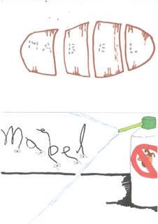
Both of these 4 sketches are hand drawn and were presented in class. Improvement was made after some criticism from fellow course mates and the tutor.
Changes and comments will be added in a separate update post.
Posted bymadguitarist at 7:45 AM 0 comments
Labels: me myself and I