Assignment 5 - HP Notebook Design: Critique and Developement
Wednesday, October 24, 2007
When I presented my idea of the Japanese Bento notebook design, some found it adorable and others found it amusing. But I am glad that most people liked the idea and did not have much comments about it. One of them did mention that the food could look more realistic.
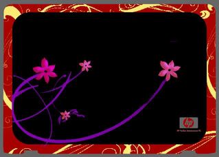
So, I went back and did my own critique of the design. The overall look was fine, but the flowers on the cover did not seem as obvious as it should be. The Sakura ( Japanese Cherry Blossoms ) are suppose to represent the country and its traditions on a bento box. So I used Photoshop and redesigned the flowers. I added an internal shadow to give it a fuller look and also brighten the colours of the purple stems slightly.
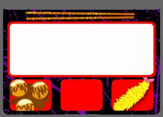
For the insides of the Bento, I gave the food items a slightly 3-dimensional feeling by using internal shadow and slight embossing. Now the food looks more realistic and less like something that I have drawn using my Tablet pen.
Here's the final product after the changes :
Posted bymadguitarist at 8:19 PM 0 comments
Labels: notebook-design
Assignment 5- HP Notebook Design
Saturday, October 20, 2007
This Notebook Design assignment is so far the one where I had the most freedom deciding what to do. We were given a choice as to what kind of theme we wanted to follow. During the lecture, we were to tell Julian what we wanted to based our designs on. I chose 'Japanese' and ' Music'.
The designing of the item is definitely more interesting then the others ,but I still have to consider that this is a Notebook design, so the specifications of the notebook have to be considered carefully when creating the design. I took very long staring at my own Notebook before I had an epiphany of an idea.
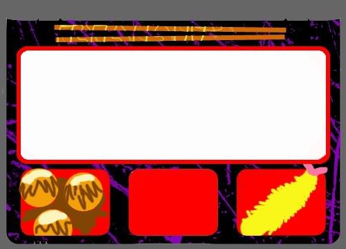
The basic structure of the notebook is very similar to that of a Japanese Bento. The Bento is a lacquered traditional Japanese lunch box. I was in fact very inspired by the interior of the laptop, because the huge keypad reminds me of the 'rice' section of the bento and the touch pad reminds me a lot of a dish compartment in the bento.
As for my 'music' themed design, I based it on a keyboard DJ machine, with a volume dial on the side and pitch tuning knobs. I took the touch pad into consideration and changed it into the black keys of a keyboard.
After looking at the two drafts of the design, I decided to develope the Japanese bento one as it is very much more unique and I am quite sure that most people would not have thought of it the way I did.
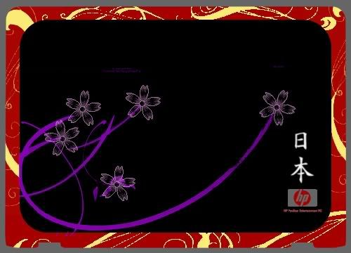
I chose to colour the given template in Photoshop, creating swirls for Sakura flowers stalks and had Japan's name written in traditional Japanese Kanji script at the right lower corner above the Hewlett-Packard logo.
The final design looked like this:
Posted bymadguitarist at 4:17 AM 0 comments
Labels: notebook-design
Assignment 4- Save This/ That: Critique and Development
Saturday, October 13, 2007
After I presented the poster in class, some of my coursemate gave me very valuable feedback.
First point was that the colour background was too distracting and takes the attention off the two paper dolls. At a glance, it was not obvious that the focal point of the poster was the dolls and not the table setting. Some suggestions were made, such as taking away the background totally or changing it to a greyscale picture.
A second point brought up was that the tape that was joining the two dolls was not obvious enough. The main focus of the poster was actually the tape 'forcing' the dolls to be together. Some suggested enlarging the taped part of the paperdolls together.
Besides these suggestions, Julian also said that the poster was not depicting the notion of love well enough. There was not much emphasis on the word 'love' besides the subtle difference in colour. He suggested adding a heart shape or two to bring in the symbolism of love to the poster.He also said that the poster might not be balanced as it only symbolise 'gay' relationships and not 'lesbian' relationship being broken up.
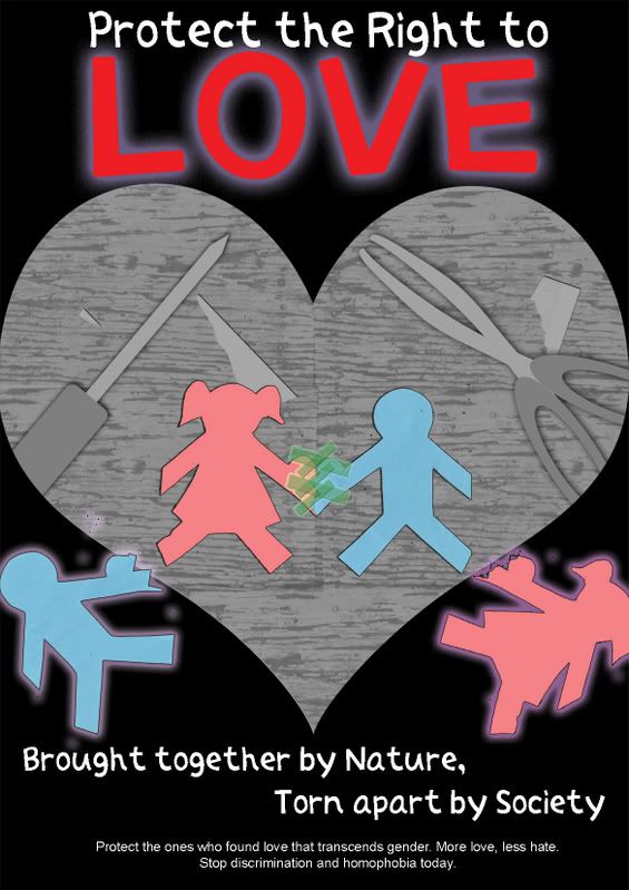
So, I have made changes generally according to the suggestions made in class. I removed the photograph background and generated a graphical background using Photoshop. Then, I desaturated the picture and used it as a background. The attention of the poster already zoomed in on the pictures of the dolls.
Then, I shaped the background in an heartshape. This shows how the two 'heterosexual' dolls are accepted in love, and the other two dolls was deprived of the right to love, by falling out of the heart shape setting. I also added another female doll to appeal to the lesbian audience. The word 'Love' is enlarged and separated from the rest of the slogan to bring out the explicit notion of love.
Here is the final poster after the changes I have made:
Posted bymadguitarist at 3:39 PM 0 comments
Labels: save this that poster
Assignment 4- Save This/That: Design Ideas
Tuesday, October 9, 2007
Save this/ that is an assignment where we could decide what we want to save or protect and do a poster design on it. There are of course very common ideas around; from green ideas like save the rainforest, protect the earth to other issues such as protect yourself from AIDs. I wanted something out of the box, perhaps a tagline that will catch attention or stay in people's mind for a period of time.
Thus, an idea strike me one night. It hit me as a tagline, a slogan for a campaign that I could design the poster for.
"Protect the Right to Love"
Love, a concept that people can seek for for the entire lifetime and still not understand. And why protect it? Because of the discrimination that people faced when they declare their love for something non-conventional. Yes, I am talking about homosexuals.
So, based on this theme, I brainstormed for ideas. Gay pride campaigns often showcase happy people, being comfortable being themselves, with their partners. One example is this poster that I found while researching for ideas for this poster.

Picture taken from Pete's Birmingham Gig Guide ( link )
The common theme with the excessive use of purple and pink colour is constantly used on gay pride campaign posters. Intimacy between the couples are also shown explicitly through their actions and poses.
However, I wanted to do a poster that conveys the message without employing such elements. The poster can be used to even teach younger children about not discriminating homosexuals and let them be aware of what is happening in the current world.
Therefore, I created a simple poster with a setting of a table with 3 paper dolls. Two of the male blue coloured paper dolls will have a perfect heart shape created when their hands joined but the heart is torn apart and the blue paper doll is forced to be stuck to a pink female doll with tape. This shows how much society is not aware of the torment these homosexuals are going through, tearing their hearts apart, and forcing them to conform to the society's norm of heterosexual marriage.
This is the draft that I presented in class :
Posted bymadguitarist at 3:11 AM 0 comments
Labels: save this that poster
Assignment 3: U C what I C: Critique and Changes
Monday, October 1, 2007
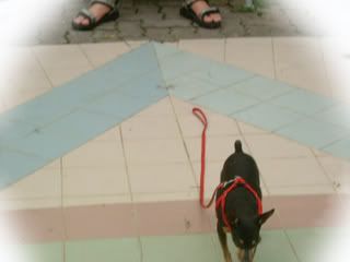
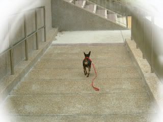
After looking at my pictures, one main concern was how the 'sleep' and 'dreaming' factor was not obvious at all. There were suggestions to either sepia print or greyscale the images that belong in the dream. However, I do not agree to doing so as it might make it a bit too obvious that it is in fact a dream , then the twist will not be of a surprise.
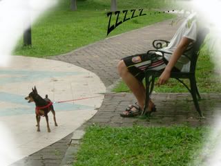
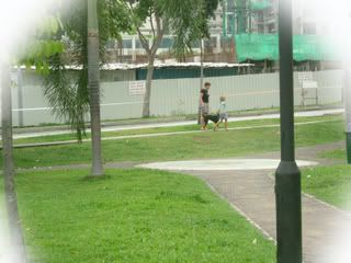
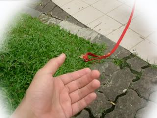
However, I agree that something has to be done to create the difference between the dog's dream and reality. Thus I decided to blur the edges to give it a dream-like feeling. Using Photoshop CS2, I selected a circular area and used the 'Feather' option, setting it to a value of 50. Then, I used a white colour soft brush with an opacity of 60% to colour the edges. Then, I copied that layer and applied it to the rest of the photographs which I wanted to have the 'dreamy' feeling.
For the first picture, I changed it to the one where Lucky and his owner was already in the park. This will allow me to insert another picture of Lucky waking up from his nap later in the story, which will show the actual twist that it was in fact a dream. I also added black text 'ZZZZZ...' to the first picture to show that the owner actually fell asleep in the park.
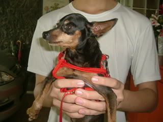
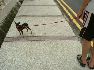
Some of my coursemates asked me why I did not show the face of the owner, I explained that I did not do that because humans tend to give their attention to other humans, and this will take the attention away from the dog, which is the main protagonist in this photograph story.
I wanted to take some new photographs to improve on this project, but from my experience in Visual Communications, I have come to realise that circumstances may not always allow you to change your projects even if you want to. My dog was not as co-operative as the first time and my second attempt at the pictures was not usable for the story.
Here's the final pictures for this assignment:
Posted bymadguitarist at 2:43 AM 0 comments
Labels: do u c what i c
