Assignment 6A- Poster Design Critique (Gestalt's Principles)
Wednesday, November 28, 2007
This assignment was to test us on Gestalt's Principles that were covered in the lecture. We have to scout for designs that we define as a good or bad design based on Gestalt's Principles.
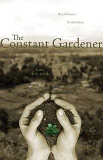
I worked with Fuzzy to look for and criticize 2 posters. The first poster that we classified as a good poster was The Constant Garderner's poster. The poster conveys a simple message and made use of several Gestalt's Principles such as continuity and flow.
I learnt more of analytical skills during this tutorial as I was exposed to not only my group's findings but also the posters that others found. It was very interesting to see that while some people might think that the poster is very cluttered, does not follow principles and classified as a bad design, it might actually be considered good to some who could see its underlying meaning.
Posted bymadguitarist at 8:42 PM 0 comments
Labels: critique
Assigment 2 - Abstraction : Critique and changes
Wednesday, November 21, 2007
The main issue was that the final abstraction I produced during the first draft was not as obvious that it is a dog. The 2nd last abstraction was deemed to be a better one. A coursemate suggested leaving the nose on the final abstraction as the nose is quite a significant part of the dog when we want to recognise something as a canine animal.
For the developed design, I traced it out on Photoshop using my Tablet pen and coloured it black for the first abstraction. Then I start removing details from the dog. Using the computer to do this is much easier as the dog remains at the same size except for the changes that I made.
This abstraction seem much better than the first and the final icon do look like a dog, which was quite an accomplishment.
Posted bymadguitarist at 11:08 PM 0 comments
Assignment 7: Children's Storybook : Storyline Creation and Design Processes
Today we got together to finalise the colouring details which Elizabeth and Furzanne have been busy with for the past few days. I was busy too, drafting out a rhyming storyline, which we have agreed on, as rhyming helps the children readers absorb and remember the story better.
Using Illustrator, Elizabeth and Furzanne
Posted bymadguitarist at 10:23 PM 0 comments
Assignment 7- Children's Storybook
Being the most important part of the entire portfolio, this was one project that I placed a lot of emphasis on. My group, Elizabeth, Furzanne and I got together to decide on the main storyline together the very lecture at which this was announced.
We decided on the theme of " Being loved even when you are different". This was partially inspired by the original theme which Julian gave us : God Created fly and forgot why
The main theme was forgotten; the character was created differently by God and was afterwards forgotten by its peers and left being ignored and unloved. This is a common situation even among young children, those who look different from most of them will be ostracized.
Thus, this is one important point we want to bring across to young children, whether they are the ones being bullied or are ostracizing others. We want to teach them that it does not matter if they are different, they might be given a special difference to be a hero to the others.
After showing our individual stories to the class, we decided on Elizabeth's story of a rabbit borned with wings. However, we were told to make some changes to the story. One point brought up was the theme of Death that Elizabeth added in to her story, was deemed to be not suitable for children . Elizabeth's rationale was that no mother will abandone the child even if the child is different. So, we have to think of a way to not let the mother be in the story, but yet still make the little rabbit sad enough to leave home, which was part of her storyline. In conclusion, we have decided to use her story but change it according to suggestions.
Posted bymadguitarist at 10:10 PM 0 comments
Assighment 6B - Website Critique
We were given a random list of universities to choose from and we were instructed to go a critique based on the website. Besides commenting on the design and how it does not follow Gestalt's principles and other principles at that, we have to think of ways to improve it in order to make it look better.
This is a build up of what I have learned int the previous tutorial on criticising posters. Besides knowing how to indentify the problem with the design, we must be able to think of ways to amend it. That is probably what visual communications is about.
I used functions on Powerpoint to highlight the problems and suggested ways such as rearranging the website using Photoshop in order to make it look better.
I have attached the slides to let everyone see what I did for the presentation.
Posted bymadguitarist at 9:02 PM 0 comments
Labels: website critique
Assignment 5 - HP Notebook Design: Critique and Developement
Wednesday, October 24, 2007
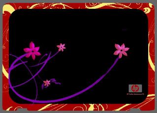
When I presented my idea of the Japanese Bento notebook design, some found it adorable and others found it amusing. But I am glad that most people liked the idea and did not have much comments about it. One of them did mention that the food could look more realistic.
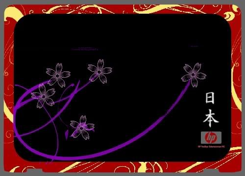
So, I went back and did my own critique of the design. The overall look was fine, but the flowers on the cover did not seem as obvious as it should be. The Sakura ( Japanese Cherry Blossoms ) are suppose to represent the country and its traditions on a bento box. So I used Photoshop and redesigned the flowers. I added an internal shadow to give it a fuller look and also brighten the colours of the purple stems slightly.
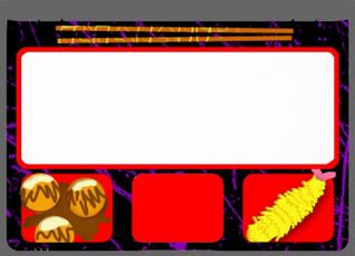
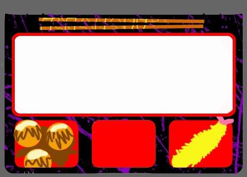
For the insides of the Bento, I gave the food items a slightly 3-dimensional feeling by using internal shadow and slight embossing. Now the food looks more realistic and less like something that I have drawn using my Tablet pen.
Here's the final product after the changes :
Posted bymadguitarist at 8:19 PM 0 comments
Labels: notebook-design
Assignment 5- HP Notebook Design
Saturday, October 20, 2007
This Notebook Design assignment is so far the one where I had the most freedom deciding what to do. We were given a choice as to what kind of theme we wanted to follow. During the lecture, we were to tell Julian what we wanted to based our designs on. I chose 'Japanese' and ' Music'.
The designing of the item is definitely more interesting then the others ,but I still have to consider that this is a Notebook design, so the specifications of the notebook have to be considered carefully when creating the design. I took very long staring at my own Notebook before I had an epiphany of an idea.
The basic structure of the notebook is very similar to that of a Japanese Bento. The Bento is a lacquered traditional Japanese lunch box. I was in fact very inspired by the interior of the laptop, because the huge keypad reminds me of the 'rice' section of the bento and the touch pad reminds me a lot of a dish compartment in the bento.
As for my 'music' themed design, I based it on a keyboard DJ machine, with a volume dial on the side and pitch tuning knobs. I took the touch pad into consideration and changed it into the black keys of a keyboard.
After looking at the two drafts of the design, I decided to develope the Japanese bento one as it is very much more unique and I am quite sure that most people would not have thought of it the way I did.
I chose to colour the given template in Photoshop, creating swirls for Sakura flowers stalks and had Japan's name written in traditional Japanese Kanji script at the right lower corner above the Hewlett-Packard logo.
The final design looked like this:
Posted bymadguitarist at 4:17 AM 0 comments
Labels: notebook-design
Assignment 4- Save This/ That: Critique and Development
Saturday, October 13, 2007
After I presented the poster in class, some of my coursemate gave me very valuable feedback.
First point was that the colour background was too distracting and takes the attention off the two paper dolls. At a glance, it was not obvious that the focal point of the poster was the dolls and not the table setting. Some suggestions were made, such as taking away the background totally or changing it to a greyscale picture.
A second point brought up was that the tape that was joining the two dolls was not obvious enough. The main focus of the poster was actually the tape 'forcing' the dolls to be together. Some suggested enlarging the taped part of the paperdolls together.
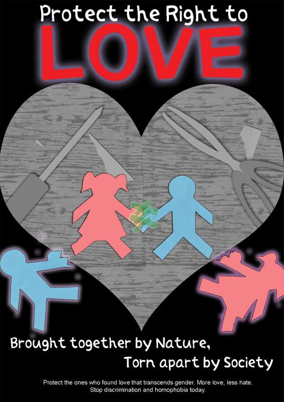
Besides these suggestions, Julian also said that the poster was not depicting the notion of love well enough. There was not much emphasis on the word 'love' besides the subtle difference in colour. He suggested adding a heart shape or two to bring in the symbolism of love to the poster.He also said that the poster might not be balanced as it only symbolise 'gay' relationships and not 'lesbian' relationship being broken up.
So, I have made changes generally according to the suggestions made in class. I removed the photograph background and generated a graphical background using Photoshop. Then, I desaturated the picture and used it as a background. The attention of the poster already zoomed in on the pictures of the dolls.
Then, I shaped the background in an heartshape. This shows how the two 'heterosexual' dolls are accepted in love, and the other two dolls was deprived of the right to love, by falling out of the heart shape setting. I also added another female doll to appeal to the lesbian audience. The word 'Love' is enlarged and separated from the rest of the slogan to bring out the explicit notion of love.
Here is the final poster after the changes I have made:
Posted bymadguitarist at 3:39 PM 0 comments
Labels: save this that poster
Assignment 4- Save This/That: Design Ideas
Tuesday, October 9, 2007
Save this/ that is an assignment where we could decide what we want to save or protect and do a poster design on it. There are of course very common ideas around; from green ideas like save the rainforest, protect the earth to other issues such as protect yourself from AIDs. I wanted something out of the box, perhaps a tagline that will catch attention or stay in people's mind for a period of time.
Thus, an idea strike me one night. It hit me as a tagline, a slogan for a campaign that I could design the poster for.
"Protect the Right to Love"
Love, a concept that people can seek for for the entire lifetime and still not understand. And why protect it? Because of the discrimination that people faced when they declare their love for something non-conventional. Yes, I am talking about homosexuals.
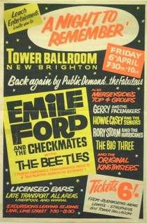
So, based on this theme, I brainstormed for ideas. Gay pride campaigns often showcase happy people, being comfortable being themselves, with their partners. One example is this poster that I found while researching for ideas for this poster.
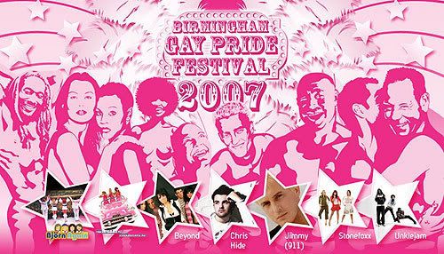
Picture taken from Pete's Birmingham Gig Guide ( link )
The common theme with the excessive use of purple and pink colour is constantly used on gay pride campaign posters. Intimacy between the couples are also shown explicitly through their actions and poses.
However, I wanted to do a poster that conveys the message without employing such elements. The poster can be used to even teach younger children about not discriminating homosexuals and let them be aware of what is happening in the current world.
Therefore, I created a simple poster with a setting of a table with 3 paper dolls. Two of the male blue coloured paper dolls will have a perfect heart shape created when their hands joined but the heart is torn apart and the blue paper doll is forced to be stuck to a pink female doll with tape. This shows how much society is not aware of the torment these homosexuals are going through, tearing their hearts apart, and forcing them to conform to the society's norm of heterosexual marriage.
This is the draft that I presented in class :

Posted bymadguitarist at 3:11 AM 0 comments
Labels: save this that poster
Assignment 3: U C what I C: Critique and Changes
Monday, October 1, 2007
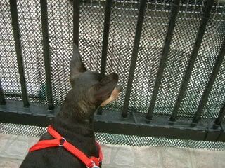
After looking at my pictures, one main concern was how the 'sleep' and 'dreaming' factor was not obvious at all. There were suggestions to either sepia print or greyscale the images that belong in the dream. However, I do not agree to doing so as it might make it a bit too obvious that it is in fact a dream , then the twist will not be of a surprise.
However, I agree that something has to be done to create the difference between the dog's dream and reality. Thus I decided to blur the edges to give it a dream-like feeling. Using Photoshop CS2, I selected a circular area and used the 'Feather' option, setting it to a value of 50. Then, I used a white colour soft brush with an opacity of 60% to colour the edges. Then, I copied that layer and applied it to the rest of the photographs which I wanted to have the 'dreamy' feeling.
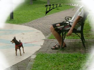
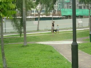
For the first picture, I changed it to the one where Lucky and his owner was already in the park. This will allow me to insert another picture of Lucky waking up from his nap later in the story, which will show the actual twist that it was in fact a dream. I also added black text 'ZZZZZ...' to the first picture to show that the owner actually fell asleep in the park.
Some of my coursemates asked me why I did not show the face of the owner, I explained that I did not do that because humans tend to give their attention to other humans, and this will take the attention away from the dog, which is the main protagonist in this photograph story.
I wanted to take some new photographs to improve on this project, but from my experience in Visual Communications, I have come to realise that circumstances may not always allow you to change your projects even if you want to. My dog was not as co-operative as the first time and my second attempt at the pictures was not usable for the story.
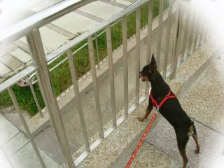
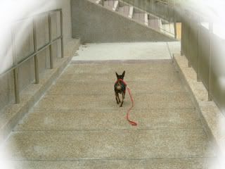
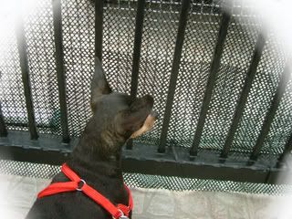
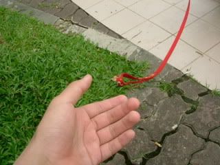
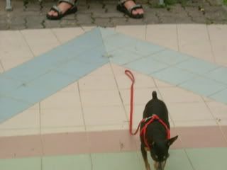
Here's the final pictures for this assignment:
Posted bymadguitarist at 2:43 AM 0 comments
Labels: do u c what i c
Assignment 3 - Do U C what I C : Thought process and first draft
Sunday, September 30, 2007
This second assignment is interesting as it is a photography assignment. The main purpose is to create a storyline using merely 10 pictures to express everything. However, we can add photography effects to get our message through. I have decided to do a mini adventure story starring my pet dog, Lucky.
So, since this is a photography assignment, I will post all the pictures in order, and only explain everything at the very end. Here goes...
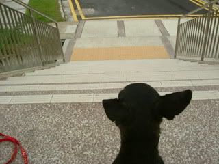
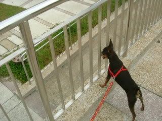
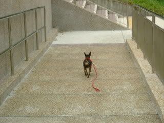

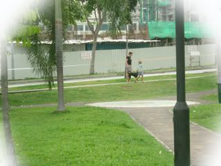
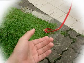
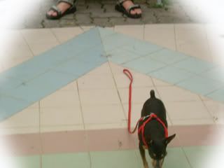
So, the basic storyline is that Lucky and his owner went for a walk in the park. His owner somehow losen his grip on Lucky and Lucky saw another dog in the distance. So, being curious, Lucky went off to check things out, only to get lost in the process. Thus, the adventurous little dog went to find his way home, challenging the intimidating stairs and finding his way in the big neighbourhood. And when he finally reached home, he realise that it was a dream... and his walk have yet to begun.
There are many comments for this and I will continue to elaborate further when I have made the changes.
Posted bymadguitarist at 4:14 PM 0 comments
Labels: do u c what i c
Assignment 2: Making Needy Images: First draft
Monday, September 17, 2007
This assignment requires us to showcase the process of abstraction. Abstraction means to reduce the number of details till the remaining image is simple but yet still contains the meaning of the actual picture.
As I am the kind of person who always seek challenges, I did not pick simple or common objects to do the abstraction on. I immediately thought of creating an abstraction of my beloved dog at home. So I sketched a picture of my dog, Lucky, on a piece of paper and prepared it for presentation in class.
One of the hardest part about sketching an animal and doing it's abstraction is proportion. I did quite a good sketch of Lucky at the beginning but slowly, the proportion started to go off. This is the full sketch that I made for the abstraction presentation in class.
(PICTURE TO BE UPLOADED )
As part of the design process, I tried abstraction on a simpler design, the television.
(PICTURE TO BE UPLOADED )
The television was easier to abstract because it had many features that are 'removable'. What I mean is, many parts of the television can be removed easily without changing the original message of what the object is. This is very different from the dog as the dog will always look funny without certain features and some features are essential for it to be interpreted as a dog.
Posted bymadguitarist at 2:51 AM 0 comments
Labels: abstraction
Assignment 1 - Me, Myself and I: Update
Wednesday, September 12, 2007
The purpose of this assignment is to derive at 2 designs eventually, one of which represent something we like and the other, something we hate.
The previous post has the original sketches and after presenting to the class, I have gathered several comments. Firstly for the "I love Sushi" sketches, most of the class thinks that the one with the 5 pieces of sushi on the plate represents my name better then the one with the egg sushi.
However, there are still many changes that would make the name more obvious. One of this is the rearranging of the sushi rolls. Another would be to add gradient and touch up the remaining background of the picture.
Thus, I used Photoshop to re-do most of the picture. One of the main changes was to reshape the 'sushi rolls' into perfect round circles. The remaining touching up was to add shadow and gradient so that the entire image have a more 'real' feeling. Although this was not suggested by my course mates, but I think that it is essential to give the artwork my best possible touch up. Thus the final artwork of the 'I love sushi' A5 poster is ...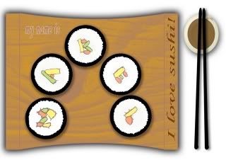
The 2nd artwork was based on what I hate, which I have mentioned in the previous post to be insects. One of the main things that was pointed out by my course mates was that the ants do not look as obvious as it should. The ants should be the focus of the design as it is the part of the design that conveys the main message. Thus I removed all the ants that I have drawn on the artwork after I scanned it into the computer and I recreated the ants on Photoshop. I added the 'emboss' effect to make the ants seem like they are 'smashed' into the shoe print. And to add to the realistic feeling of the artwork, I added a fallen leaf and a wilthered flower to add to the natural setting. A muddy texture is also added to the area outside the shoe print to make it look like real soil. The an internal shadow is added to the shoe print to have the 'impressed' effect and to make it look sunken and not as flat as the drawn sketch.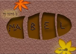
After all the changes, the final artwork for the "I hate insects" artwork is as such...
Posted bymadguitarist at 10:11 AM 0 comments
Labels: me myself and I
Assignment 1 - Me Myself and I : Design Process
Saturday, September 8, 2007
This blog is started for NM2208.
I guess this will be pretty interesting for both myself and the tutor to keep track of my ideas and what I plan to do.
Firstly, I think I might want to keep track of my initial design for the first assignment. These are hand-drawn and presented to the class during the first tutorial. The topic was something like: My name is _____ and I love/hate _____.
So, the first thing that I thought of that I love was music. But after thinking it through, it is very hard to materialise my passion for music in to something on paper. Besides, the idea itself might be overused by my peers. So I decided on something more specific: sushi. It's not only my favourite food, it represent my love for Japan and all of Japan's wonderful culture. Thus, my sketches below show an egg sushi with the brown patterns showing my name and the second picture show 5 sushi rolls with the ingredients inside showing alphabets of my name.

Then for the thing that I hate, despite the ordinariness, I decided to focus on my dislike for insects. So I thought of the ways that I can kill insects with. So I came up with 2 basic drawings for the theme of 'hate', one where a shoe print in the mud shows many ants dead and forming my name, the other show a bottle of insecticide and the last 'flying actions' of the insects forming my name.
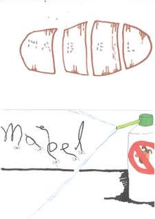
Both of these 4 sketches are hand drawn and were presented in class. Improvement was made after some criticism from fellow course mates and the tutor.
Changes and comments will be added in a separate update post.
Posted bymadguitarist at 7:45 AM 0 comments
Labels: me myself and I